
YOUR BRAND STYLE IS...
BRIGHT CLARITY


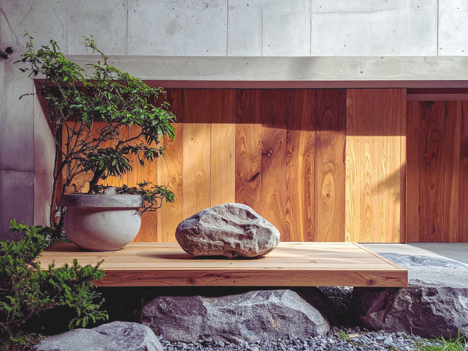
YOUR AESTHETIC IS...
Fresh
Uplifting
THE BRAND BREAKDOWN
YOUR VISUAL DIRECTION
This style is about openness, light, and clarity.
Bright Clarity creates a sense of space and possibility. It feels fresh, and easy to engage with – like stepping into a room filled with light.
There is a natural optimism here – without being overwhelming.
WHY THIS DIRECTION WORKS
Clarity builds trust.
This aesthetic helps people understand your work quickly and feel good while doing so. It removes friction and creates an experience that feels accessible, welcoming, and energizing.
It´s simple – but never empty.
WHO THIS NATURALLY ATTRACTS
You´ll attract people who are looking for clarity, inspiration, and a fresh perspective.
Your audience values:
ease and accessibility | inspiration without pressure | clean, uplifting environments
They want to feel lighter after interacting with your brand.
Your audience values:
simplicity over excess | intention over distraction | quiet confidence over constant visibility
DESIGN SYSTEM
Color Palette
Base colors
fresh white space | cool mist mint | soft aqua haze
Primary accents
clean mint | aqua clarity | soft growth green
Secondary accents
cool gray | light graphite | minimal contrast tones
Typography
Primary font
Playfair Display
Secondary font
Inter
Accent font
Playfair Display Italic
Photography
Style
Brigt, airy, uplifting
Content
open spaces | movement | light-filled environments
Settings
strong natural light | soft highlights | minimal shadows
Props
light fabrics | glass elements | subtle lifestlye objects